Monday, 17 August 2015

Rationale 1 & 2

Rationale 1

Contrasting graph(ic) and data visualization (Ihi) Intriguing (Wehi), "Brainy Graph"
The topic is public schools versus private schools, and the perspective of the poster is that the amount of resource pooled into public schools should provide better education for children. The issue is the difference in the amount of knowledge and thus opportunities offered between public schools and private schools. Main rhetoric devices used are juxtaposition and metonymy. The ihi component is the contrasting graph used as graphic, data visualization, and the wehi component is intriguing. A vibrant color theme was used to catch the attention of both parents and children. Flat design style is used along with a simplified illustration of the human brain instead of a graph to present data, for ease of comprehension, to make data more intriguing, to emphasize on the perspective and overall give a better persuasion to the audience.


Rationale 2

Data visualization (Ihi) Vibrant (Wehi), "$45 million versus $45 million times 4"
The topic is public schools versus private schools, the perspective of the poster is that the amount of resource or funding pooled into public schools are superior to that of private schools and therefore should provide better. The issue is the difference in the amount of knowledge and thus opportunities offered between public schools and private schools. The ihi component is data visualization, and the wehi is vibrant, fun, interesting. Main rhetoric devices used are juxtaposition and metonymy. An overall vibrant palette was used to catch the attention of both parents and children, with color for the books chosen individually from colors that are attractive to children. Elements on the public side have more vibrancy and saturation than those on private sides, albeit having the same shade and shape, inferring more fun. A graduation hat was added on the public side, implying more success.

Poster wall


Week 6 - Session 1, minor fixes and print out


Caroline commented that why not make the two piles of books the same, just different saturation/colors to highlight the contrast, and I tried that. Also changed the colour of the background slightly for better overall harmony. Matt commented that the shift of value between the 2 school parts is too much, private is like a 2 and public is like a 4? But I thought that's a good thing because what I want is for the contrast to show clearly. 
I tried drawing in some lines but I can't get the pattern of the brain right, and they ended up being "wishy-washy" like Matt commented. I also increased the saturation of all the colours so it looks more vibrant. Line width also fixed to be smaller

So I just lost the pattern altogether. The percentage between the red and yellow parts was also fixed to be more accurate with the number according to Matt. Overall I was satisfied with the final. Caroline commented on it having a Chinese feel.

Sunday, 16 August 2015

Poster 2 redesign

The concept of this one is basically public school has more diversity regarding races among students. I tried to portray that by silhouettes, 1 for each 10%, instead of doing a graph. However, it came out dull, uninviting, lame? or cliche according to feedback from friends. I tried to think of another way to approach it, but I couldn't, so I looked into other ideas instead
I had the idea for this one after reading an article about private schools (in NZ) demanding more funding for them, claiming that public schools get 4 times more the funding they get. Again, I used elements to represent data instead of graphs. I also tried to use vibrant colours, especially ones that children like. I handpicked the colours for each book from a palette made for kids. This got a lot of better response so I went with this one.


Saturday, 15 August 2015

Research (2)

I read some more into the difference between public schools and private schools, to search for different ideas
http://nobullying.com/bullying-in-public-schools/
http://news.jrn.msu.edu/bullying/2012/04/01/private-school-bullying/
https://meganmeierfoundation.wordpress.com/2015/05/29/bullying-in-school-public-vs-private/
http://forums.anandtech.com/showthread.php?t=2210132
http://bulliesbegone.com/blog/2010/12/06/more-bullies-in-public-or-private-schools

Apples and pears: blurring the line between public and private schoolshttp://www.ppta.org.nz/resources/pptanews/262-pptanews-publicprivate0309

https://nz.lifestyle.yahoo.com/practical-parenting/all-about-parents/a/16201040/public-vs-private-school/

I did a lot of research on bullying in public vs private school, but ended up concluding that it's mostly the same, so I dropped that idea.

http://www.stuff.co.nz/business/money/8279391/Is-private-school-a-good-investment
http://www.metromag.co.nz/city-life/education/best-auckland-schools-2014/
https://blog.greens.org.nz/2012/06/05/double-standards-private-schools-receive-government-funding-while-state-schools-are-left-scrounging/
http://www.radionz.co.nz/news/national/132786/private-schools-want-funding-indexed-to-state-schools

Now this was where I found out public school get more governmental funding than private school, so I searched for more

https://www.educationcounts.govt.nz/statistics/schooling/resourcing/47696
https://www.educationcounts.govt.nz/statistics/schooling/resourcing/per-student-funding

(This link only counts funding for public school though, and I couldn't find out the exact number of funding for private school, so I went with the numbers on the radionz article)

Friday, 14 August 2015

Week 5 - Interim 2

Critics: overall ok
Could be made stronger by shifting the background to more turquoise or brighter
Could add more pattern to be more interesting and up the contrast

Critics: overall boring, does not attract people to go public
Color scheme/Background dull
Does not represent "fun" as opposed to text
Script + script font = no
Make title sans serif
=> Redo

Wednesday, 5 August 2015

Week 4 - Further Development


I tried to do the handprints-instead-of-petals idea, but it was much harder than I thought. So many things had to be considered because I wanted to make it seem real: Where would the handprints be? On the wall, on a fence? What kind of wall or fence? Should the text be hand drawn in paint as well? At one point I even considered hiring kids to paint on some wall for me, but then I asked myself again and again, will kids really paint that they love their school on the wall? And it didn't seem realistic to me, so I dropped the idea altogether.

I decided to try the same idea with a different approach. I still want to show a kid's love for public school for its diversity, so I thought of that being in a diary instead of something as flashy as paint on a wall. For this I took an image of a real notebook, with a font traced from a five-year-old girl to keep things looking real. 

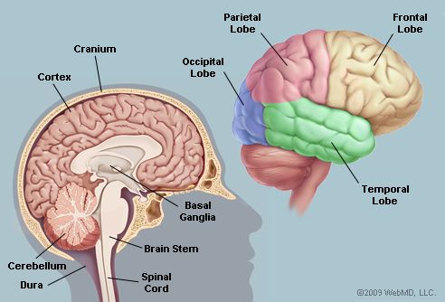
For my second poster, I tried to think completely differently, approaching it from a more logical point of view rather than from emotions (of the kids) alone. So I took data of the number of teachers and made it into a graph. I looked into making a pie chart (as in the previous research post), but that looked too boring, so thought of spicing it up by making a chart, but not in a shape of a chart...? So I came up with the brain as the chart instead. Blue, orange, yellow because primary colors complement each other well, but I chose a pastel shade for them as that suits the flat style more.

Tuesday, 4 August 2015

Idea research

Looked into pie chart generators
https://www.meta-chart.com/pie
http://ceagon.com/tools/charts - this one was very interesting, and I played around with it a bit, but the results seemed rather dull, so I thought of some other ways to represent the data

Which brought me to think, why not instead of a circle, represent it by something that symbolizes knowledge => the brain
Brain image researched

Data research into topic

Articles and sites I've read through to find data for my ideas
https://web.stanford.edu/class/e297c/poverty_prejudice/school_child/public.htm
http://thehomeeconomist.com/2013/09/10/public-schoolvs-private-schools-secret-gov-stats/
http://www.theatlantic.com/education/archive/2015/03/why-im-a-public-school-teacher-but-a-private-school-parent/386797/
http://www.statcan.gc.ca/pub/11f0019m/11f0019m2015367-eng.htm
https://ink.niche.com/school-bullying-report-card/ (not very helpful since it shows favourable stats towards private schools)
http://www.brainyquote.com/quotes/keywords/public_schools.html (for quotes, ended up not choosing any)
http://www.goodreads.com/quotes/tag/public-school (same as above)


I also realized/admitted at this point that the general public opinion about public schools is rather negative... so I will have to search for raw data and persuade the audience with my own words.

Thus I came across this site and digged up data myself
https://www.educationcounts.govt.nz/statistics/schooling/student-numbers/6028